2024.05.20 - [Canvas] - [Canvas] 파티클 그리기 | 애니메이션 추가(requestAnimationFrame)
[Canvas] 파티클 그리기 | 애니메이션 추가(requestAnimationFrame)
* 현재 js 코드 *const ctx = canvas.getContext('2d')const dpr = widdow.devicePixelRatioconst canvasWidth = 300const canvasHeight = 300canvas.style.width = canvasWidth + 'px'canvas.style.height = canvasHeight + 'px'canvas.width = canvasWidth * dprcanvas.
gamzaggang7.tistory.com
* 현재 js 코드 *
const canvas = document.querySelector('canvas')
const ctx = canvas.getContext('2d')
const dpr = window.devicePixelRatio

const canvasWidth = innerWidth
const canvasHeight = innerHeight

canvas.style.width = canvasWidth + 'px'
canvas.style.height = canvasHeight + 'px'

canvas.width = canvasWidth * dpr
canvas.height = canvasHeight * dpr
ctx.scale(dpr, dpr)

class Particle {
  constructor(x, y, r, vy) {
    this.x = x
    this.y = y
    this.r = r
    this.vy = vy
    this.acc = 1.05
  }
  update() {
    this.vy *= this.acc
    this.y += this.vy
  }
  draw() {
    ctx.beginPath()
    ctx.arc(this.x, this.y, this.r, 0, Math.PI / 180 * 360)
    ctx.fill()
    ctx.closePath()
  }
}

const Total = 15;
const randomNumBetween = (min, max) => {
  return Math.random() * (max - min + 1) + min
}
let particles = []

for (let i = 0; i < Total; i++) {
  const x = randomNumBetween(0, canvasWidth)
  const y = randomNumBetween(0, canvasHeight)
  const r = randomNumBetween(50, 100)
  const vy = randomNumBetween(1, 5)
  const particle = new Particle(x, y, r, vy)
  particles.push(particle)
}

console.log(particles);

let interval = 1000 / 60
let now, delta
let then = Date.now()

function animate() {
  window.requestAnimationFrame(animate)
  now = Date.now()
  delta = now - then

  if (delta < interval) return

  ctx.clearRect(0, 0, canvasWidth, canvasHeight)

  particles.forEach(particle => {
    particle.update()
    particle.draw()

    if (particle.y - particle.r > canvasHeight) {
      particle.y = -particle.r
      particle.x = randomNumBetween(0, canvasWidth)
      particle.r = randomNumBetween(50, 100)
      particle.vy = randomNumBetween(1, 5)
    }
  })

  then = now - (delta & interval)
}

animate()
파티클에 gooey 효과를 주기 위해 canvas에 필터를 적용한다.
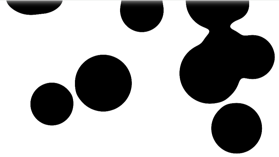
blur와 contrast 값을 더 높이면 더 끈적끈적한 효과가 나타난다.
이러한 contrast 효과는 배경색을 지정하지 않으면 일어나지 않는다. 그렇기 때문에 css의 필터 효과가 아닌 svg의 필터 속성을 이용해 커스텀 필터를 정의하는 방법을 알아보자. 위 css 코드는 주석처리한다.
html에서 재사용가능한 필터를 정의한다.
filter태그를 만들고 먼저 blur 효과를 만든다. 이때 사용되는 svg 필터는 feGaussian이라는 필터이다.
- stdDeviation은 블러의 강도를 결정한다. 위에서는 가로 세로 뱡향에 동일한 정도의 블러 효과를 적용한다.
- in 속성은 블러를 적용할 입력 이미지를 지정한다. SourceGraphic은 필터가 적용될 원본 그래픽을 나타낸다. 즉 svg 요소 자체에 필터가 적용된다.
- result 속성은 필터의 출력 결과에 이름을 붙인다. 여기서는 블러처리된 이미지를 blur1이라고 이름을 붙였다.
이렇게 만든 필터를 css에 적용할 때는 id를 사용하면 된다.

필터가 잘 적용되었다.
여기에 contrast값을 주면 gooey 효과가 완성된다. feGaussianBlur 아래에 다음 코드를 추가한다.
feColorMatrix는 입력된 이미지를 색상 변환 매트릭스를 통해 조절한다.
- in: 처리할 입력 이미지를 지정한다.
- mode: 색상 변환 방식의 모드를 지정한다. matrix 모드는 5*4 행렬을 사용하여 색상을 변환한다.
- values: 색상 변환 행렬의 값을 설정한다. 첫번째 행은 빨간색 채널 변환, 두번째 행은 초록색 채널 변환, 세번째 행은 파란색 채널 변환, 네번째 행은 알파 채널 변환을 의미한다.
현재는 입력 이미지의 각 색상 채널을 변경하지 않고 그대로 유지한다. 즉 입력 이미지에 아무런 변화가 생기지 않는다.
여기서 아래처럼 코드를 수정해보면

gooey 효과가 나타난다.
이 svg 필터를 테스트해볼 수 있는 사이트가 있다. -> https://yoksel.github.io/svg-filters/#/
SVG Filters
yoksel.github.io
'Canvas' 카테고리의 다른 글
| [Canvas] 캔버스 resize (0) | 2024.05.22 |
|---|---|
| [Canvas] dat.GUI 사용하기 (0) | 2024.05.22 |
| [Canvas] 파티클 그리기 | 애니메이션 추가(requestAnimationFrame) (1) | 2024.05.20 |
| [Canvas] window.devicePixelRatio (dpr) (3) | 2024.04.18 |
| [Canvas] 캔버스 사용하기 | 캔버스 사이즈 | fillRect() (51) | 2024.04.14 |